In Defence Of Dialog
Safari 15.4 now supports <dialog> and related features.
I'm a huge fan of <dialog>, I even maintain the polyfill, so I thought I'd explain this element—and why its modal feature is the best—plus some extra thoughts on its other features.
Read on! 🎉
⚠️ Sorry, your browser doesn't support <dialog> here, so these demos don't work.
Try loading this in Chrome or the Safari release with support.
The Modal Use-Case
This is the primary use-case for <dialog>, and deserves its own section.
Try it out!
Here's a simplified version of the code needed to do this:
<dialog id="foo"><p>Hello! I'm a modal dialog...</p></dialog>
<button id="open">Open Dialog</button>
<script>
  document.getElementById('open').onclick = () => foo.showModal();
</script>
You might ask: fine, but why is this important—why do I care more than a couple of elements set to position: fixed?
-
You can control your user's focus. While the dialog is open, try pressing TAB to focus on links or elements in the backing page—notice that you just can't get to them. The top-most open modal dialog always contains your user's focus, without any extra JavaScript required.
-
You can open a modal dialog anywhere in your HTML tree, and it will "escape" your layout. HTML has a notion called stacking context, which is closely tied to
z-index. It's honestly a mess, and there's a gazillion posts trying to help new developers understand it.<dialog>totally eskews this, and puts itself right on top of your whole page.
To demonstrate, here's that same dialog that's actually inside a 3D transformed element—and this element is definitely creating a stacking context.
The code looks something like this:
<div style="transform: rotateX(25deg) rotateY(10deg) translateZ(0px">
  <dialog><p>Hello! I'm a modal dialog...</p></dialog>
</div>
…but the superpower of <dialog> is that it doesn't care.
It's just going to hoist itself out of that nested HTML and display at the top-level of your page. 🏗️
In some frameworks, the way this kind of modal behavior is built is by hoisting the dialog-like element to be a direct descendant of <body>.
(There are even some cool tricks with Shadow DOM that I won't cover here, although I don't think they're in widespread use.)
That's fine, but prevents any kind of encapsulated re-use.
With <dialog>, your random element can pop up a modal—yes, that won't be for everyone, but it lets you build and ship code that is properly encapsulated (e.g., standardized, native, interoperable Web Components).
Use-Case Demos
Now that's out of the way, let's get to some weird ways we can use this element. Finally! 🥳
Non-Modal Dialogs
I've talked a lot about modal dialogs being the best, but that implies the existance of non-modal dialogs.
That's right!
A dialog can be opened simply by adding the open attribute to its HTML, or by calling .show().
Here's our dialog and what its code looks like:
<dialog open>
  <p>I'm an open non-modal dialog</p>
</dialog>
…sorry, it's kind of underwhelming.
Interestingly, modal dialogs will also have the open attribute added to them, so you can set CSS based on that (i.e., dialog[open]).
But the only way we get our ✨🏗️ magic hoisting behavior 🏗️✨ is to call the .showModal() method.
Honestly, non-modal dialogs are basically boring inline elements which don't escape a stacking context—I hate to say it, but why not use a <div>, perhaps with the correct aria attributes.
There is a reason to use them—the form behavior I describe below, so read on to find out more.
Sidebar / Nav Bar
I can place a modal <dialog> on the page in any sort of fixed position.
Try it out.
A sidebar!
Maybe this contains a lot of links. Click the page on the right to close me.
This combines a few concepts.
Firstly, the position.
The <dialog> has a default user-agent stylesheet which determines much of how it is positioned on the page (plus magic ✨ behavior that puts it on top).
Regardless, by default, you can largely treat it as an element which is positioned in the center of the user's viewport via margin: auto (one of many ways to center things in CSS).
So, we can override these values—remembering to set margin: 0— to position the <dialog> at a different position.
Secondly, the demo allows you to click on the "page" area to close it.
Did you notice how it had a slightly blue tint?
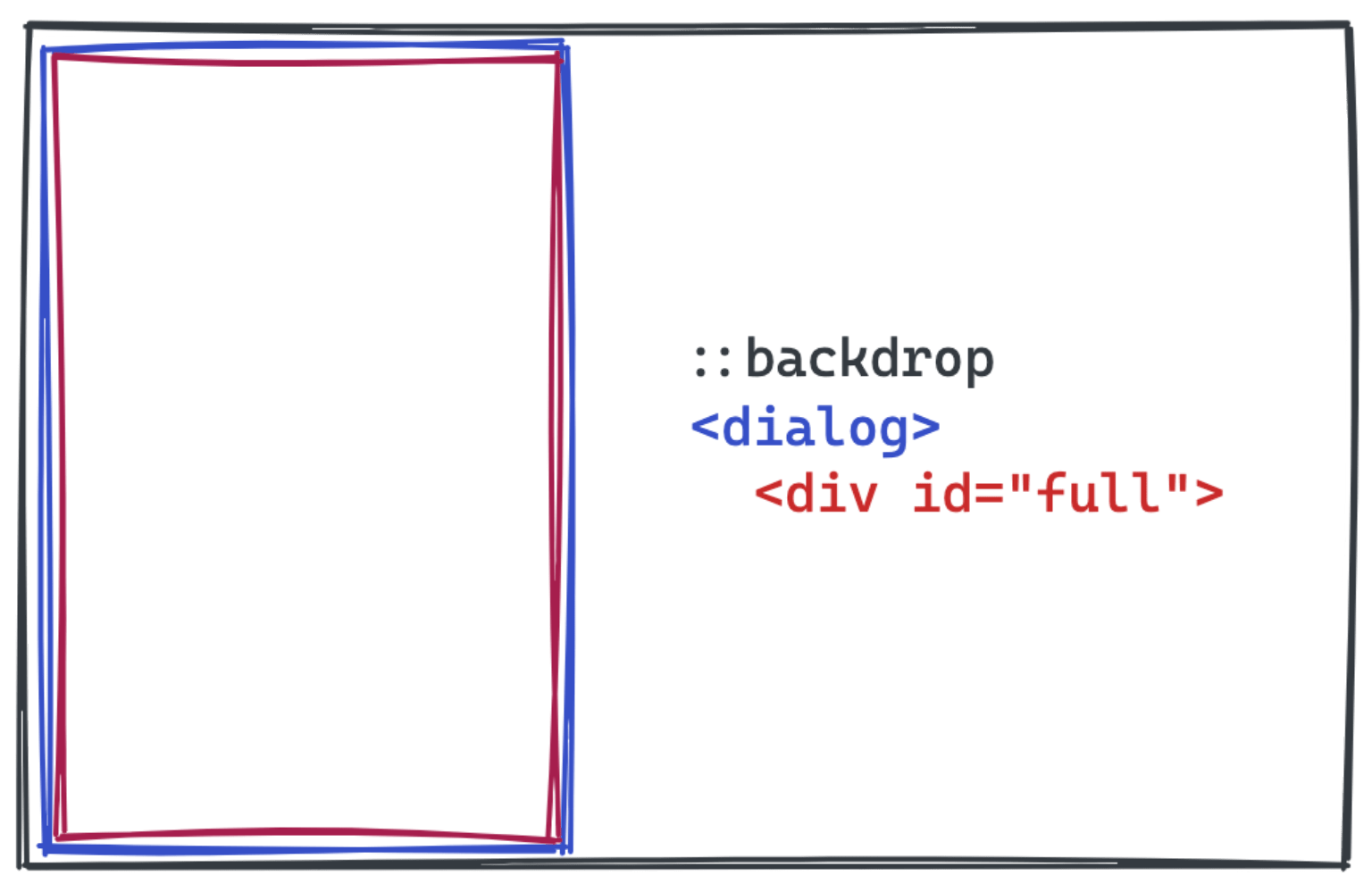
That's because we styled the dialog::backdrop element like this:
dialog::backdrop {
  background: #ccf8;
}
The ::backdrop is a new pseudo-element that exists before the <dialog> in the DOM order.
This is actually unlike other pseudo-elements (e.g., :after), which exist within a certain element.
(Chrome's Developer Tools actually don't show ::backdrop, probably for this reason.)
You might know that you can't actually detect clicks on pseudo-elements. That's true. What we do is add a handler like this:
dialog.addEventListener('click', (e) => {
  if (e.target === dialog) {
    dialog.close();
  }
});
…which says, if the dialog itself is clicked, close it. This works because we create another element which takes up the entire space of the dialog, which should receive clicks first.
You can intercept a lot of events this way, e.g., for using swipe to close a sidebar.
(As an amusing side, there's a good demo in jQuery that shows this swipe pattern, but it's fom 2013 and does not use <dialog>.)
A quick aside on the ::backdrop: it is a real element, and it's possible to hide it or make it not take up the full size of the page.
In Chrome, shrinking the element allows clicks to flow through, even though this won't change focus.
(This is probably a bug, but it's been this way since the very first release in Chrome—Safari doesn't have the same problem. Maybe just don't do this? 🤔)
Submitting User Data
This one is a bit—it's fine, but is a bit of a strange legacy.
The <dialog> spec describes <form method="dialog">, which is a special type of form which closes a dialog on submission.
Here's a demo which uses a non-modal <dialog> and allows you to submit a form.
As well as closing the dialog (presuming you allow the submit event to occur—you can prevent the event, just like on a regular form) then the value of the <button> or <input> used to submit the form will be placed on dialog.returnValue.
You can also programatically close a dialog with dialog.close(value), and that value will also appear on dialog.returnValue.
This has been my crash-course on <form method="dialog">, yet… it's strange: you basically can't use <dialog> without JS anyway.
From that point of view, you may as well create a normal <form> (which, to be fair, does have the default method of GET) and overwrite its behavior.
I honestly suspect the authors of the spec imagined the web to end up being much more semantic than it actually was, and that somehow we could tie them together all with declarative components provided by the browser.
Remember <dialog> was built in jQuery's heyday—components (React or Web Components) were barely thought about, and I think there was an explosion of what elements could be built-in. 💥
Stacking Dialogs
Turns out, we can open multiple modal dialogs at once and they're stacked in the order in which they're created, regardless of their position within the HTML on your page.
Of course, since users can only interact with the open <dialog>, it's likely that you're nesting dialogs that way.
I've used the sidebar demo from before but included a way to open more dialogs. Try it out.
Sadly, there's no way to find out which dialog is "most open" via JS.
You can keep track of it by which call to .showModal() you made last.
Escape Key
Dialogs can be automatically "canceled", as the the spec describes, by e.g:
…the user pressing the "Escape" key.
We can actually prevent this from happening if we like, perhaps if a user must complete a modal form before continuing.
You can listen for the cancel event and prevent it:
const d = document.querySelector('dialog');
d.addEventListener('cancel', event => event.preventDefault());
d.showModal();
And here's a demo. Don't worry, you can still press a button on the dialog to close it:
There's actually no implemented equivalent on mobile—where's my escape key again?
Using your phone's back gesture goes back on the current page, rather than closes the open dialog.
This is probably intended—you shouldn't be able to hold a user on your page if they actually want to leave (well, except for the totally unrelated beforeunload prompt).
The Close Watcher proposal is attempting to solve this problem—<dialog> is in fact its 1st listed use case—but as of November 2021, is mostly just theoretical.
Fixed Or Scrolling
In playing with all these demos, you've probably noticed that <dialog> shows in the center of your screen and you can still scroll around the page behind it.
This is actually even true for the sidebar case, even though it takes up the full height of the page.
Preventing scroll behind the dialog is actually tricky to solve, but a bit awkward.
In the end, you just want to apply overflow: hidden to your <body> element while any dialog is open.
(Note that this will be a bit jarring for folks who have visible scrollbars—suddenly they'll be gone! Fixing that is out of scope of this post.)
Here's a demo:
This is awkward, because dialogs are these awesome elements that totally work in isolation—you're telling me they have to play nice with others? Well—yes. HTML isn't a frictionless, spherical cow.
This demo introduces one last event, which is close.
No matter how a dialog is closed, whether through the <form method="dialog"> behavior or hitting the ESC key, you'll get a close event.
In our case, we use it to clean up the changes to <body>:
button.addEventListener('click', (event) => {
  dialog.showModal();
  document.body.style.overflow = 'hidden';
});
dialog.addEventListener('close', (event) => {
  document.body.style.overflow = '';
});
And that's it.
Accessibility
This post is really not about how to make or ensure the <dialog> is accessible.
Scott O'Hara has a great post from a couple of years ago on this.
Self-Indulgence
As a total side note, I have some incredibly minor claim to Safari supporting <dialog>.
Bear with me.
Maybe 3-4 years ago, I worked with Alex Danilo, who was at the time an editor of the W3C fork of the HTML spec.
Notably, this was a living spec—it's supposed to represent reality.
Yet, the only shipped implementation of <dialog> existed in Chrome, and the rule at the time was features should only be in the spec if they had more than one vendor's support.
Firefox did, and still does, have a version of <dialog> behind a flag.
I think it's not complete yet—I haven't researched it for this article, where I've only tested with Chrome and Safari.
I made a strong case to Alex that the web would be worse off with <dialog> gone, so he took the case that Firefox's partial implementation effectively meant "it wasn't just Chrome that'd implemented it".
I don't pretend to understand the politics that existed between W3C and WHATWG, but, maybe <dialog> would have been cut years ago from W3C HTML, and Safari may never have built it.
Anyway, you're welcome. 👏
Thanks
That's all!
If you're looking for more resources on <dialog>, Google is your friend—turns out, it's been around for years, and you can literally find posts from the early 2010's.
But, excitement fizzled out as the feature languished only in Chrome.
Today, those posts are becoming a lot more relevant again.
One fun fact is that <dialog> was originally intended to be about representing a literal dialogue: a conversation between participants.
See this post from 2009.
You'll rarely find this kind of resource, though.
I hope you've found this interesting and I'm excited to see what folks come up with, whether <dialog> is used natively or as part of a broader framework.
Follow me on Twitter. 🐦